

The first step to doing anything effectively is identifying what you’re trying to achieve, and with a mobile app’s landing page, there tends to be one universal goal: Get users to download your app. Sure, if the app is not released yet, you might have the option to join a mailing list that will notify the user when your app is released, but ultimately the goal is the same. You want them to be interested in the use cases of your app – interested enough to want to use it themselves.
Assuming that a successful landing page is one that converts well, here are 8 tips that, if employed correctly, should boost the success of your landing page.
1. Clearly display your product & services.
The whole point of an app landing page is to advertise your new app – and the point is moot if your page doesn’t appropriately convey the purpose of your app. What does your app do? What problem is it trying to solve? A little bit of mystery is great – it promotes intrigue, and in fact, we encourage it. But users won’t know to want something if they don’t know what it does.
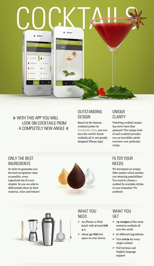
Example: The Cocktail App
Representing a recipe app is fairly straightforward, but The Cocktail App is a recipe app that is highly visual, down to pictorial representation of kitchen equipment and appropriate glassware. They do a perfect job of demonstrating what sets The Cocktail App above other recipe apps, without going too overboard.
2. Demonstrate functionality.
As an avid user of apps, I always preface any app downloads with a quick scroll through the screenshots – mostly because I want to see how the app is going to work before I download it. It’s better to show your user what your app does, rather than tell them. Screenshots or animations are a great way to do this.
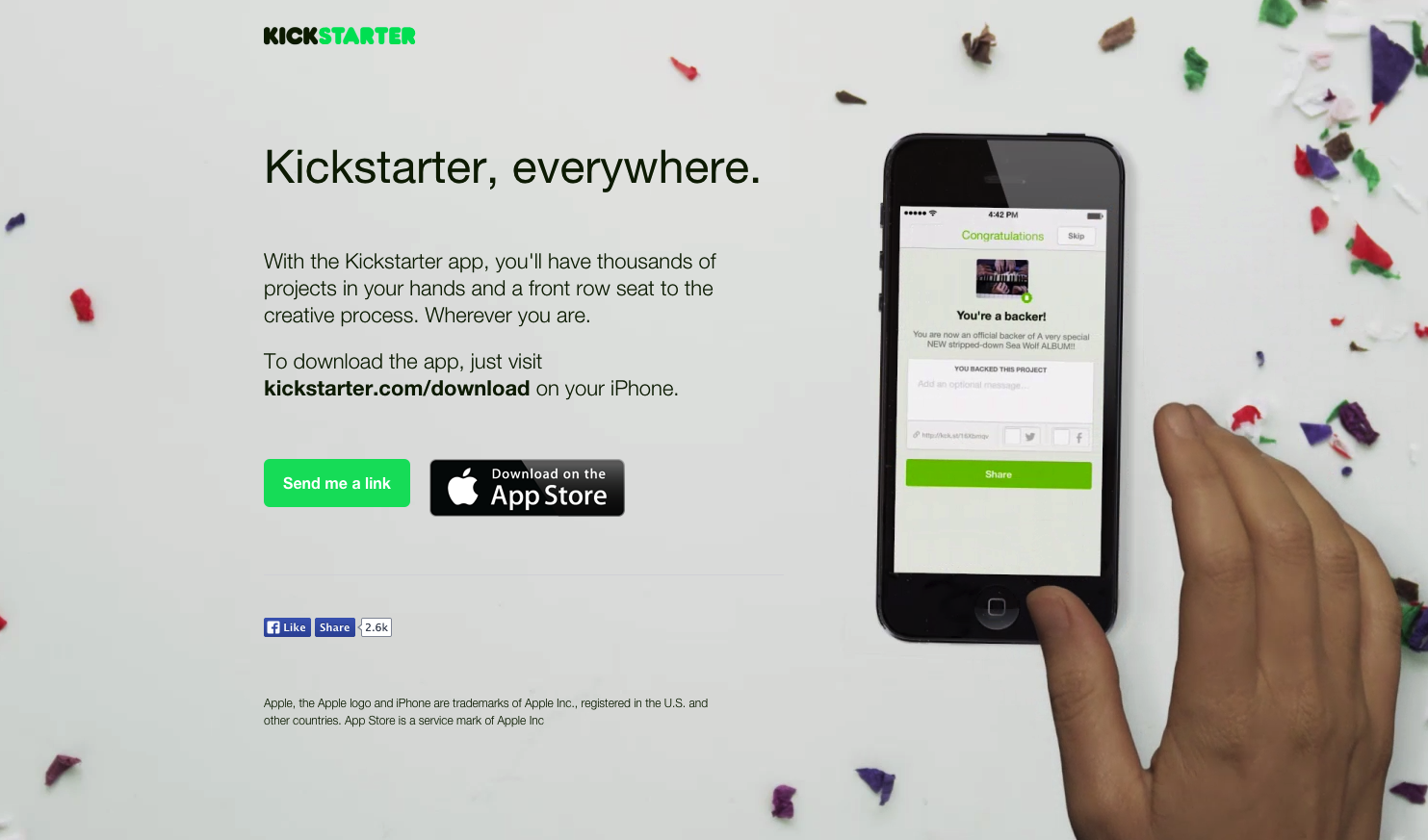
Example: Kickstarter
Kickstarter’s app landing page is brilliant. The copy is minimal, but still informative – it doesn’t assume that the audience has heard of Kickstarter before. The greatest part, however, is the animation that shows an actual hand using the app. The only greater demonstration of functionality would be a live one.
3. Follow the rule of ‘less is more.’
A landing page should read like a handshake, it should be minimalist and to-the-point. As a general rule, people don’t like to take on new ideas or products if they are too complex. Make your landing page ‘easily digestible’ by only displaying what’s truly necessary to fulfill the needs of point 1 and 2. A landing page is not the place for FAQ and How-To…Let your audience take it upon themselves to learn more if they choose to. Seth Godin recently blogged a post titled < http://sethgodin.typepad.com/seths_blog/2014/10/google-it.html > “Google it!” stating that a passionate pitch is one that drives inquiry. “Your only job is to get them to care enough.” Do that, and they’ll seek more information on their own – probably by downloading your app!
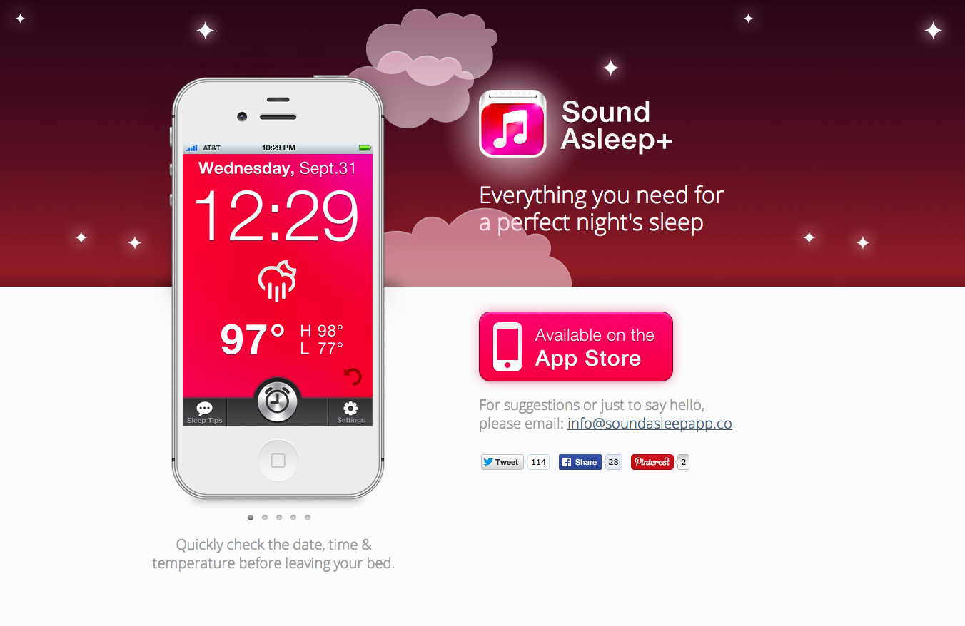
Example: Sound Asleep+
Sound Asleep+ is a dual ambient sound/alarm app, and they convey this on their landing page without even employing the use of a scroll bar. A simple slider of app screen shots shows their purpose perfectly.
4. Appeal to emotions.
Emotional appeal can be used to persuade your audience into action. Marketing studies show that tugging on those heartstrings is one of the greatest ways to influence decision making, so make the consumers that land on your landing page feel something.
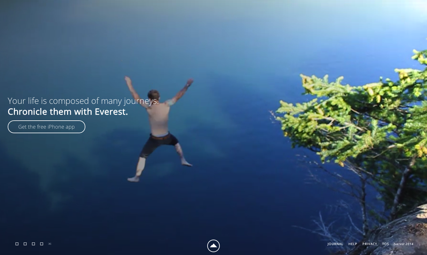
Example: Everest
Everest is a unique social media ‘dream sharing’ app (the ambitious kind, not the sleep kind). Users set goals, break them down into actionable steps and chronicle their success along the way. Instead of explaining this, Everest’s landing page is predominantly composed of a series of video clips of people achieving feats like biking marathons and cliff diving.
5. Make good use of animations.
Don’t go overboard, and don’t use animations without a purpose. Remember that users expect some level of motility from modern websites, and harness that to engage.
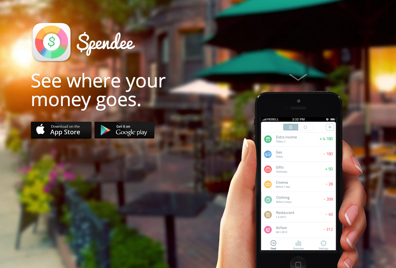
Example: Spendee App
The Spendee App has a beautiful, animated design that takes content which might have traditionally been placed in a slider and instead incorporates it into a scroll function, where the text and the screenshots scroll. It’s interactive enough to keep users hooked ‘til the very end of the page, which is often a problem that needs solving where landing pages are concerned.
6. Know your audience.
This could also be, “know your brand.” The two certainly go hand-in-hand, as good branding is all about knowing whom your brand will appeal to. And don’t just think in generations, either. People who market broadly to ‘millennials’ are missing the mark. What are the kinds of people who would download your app interested in? This is a good place to start building the content of your app landing page.
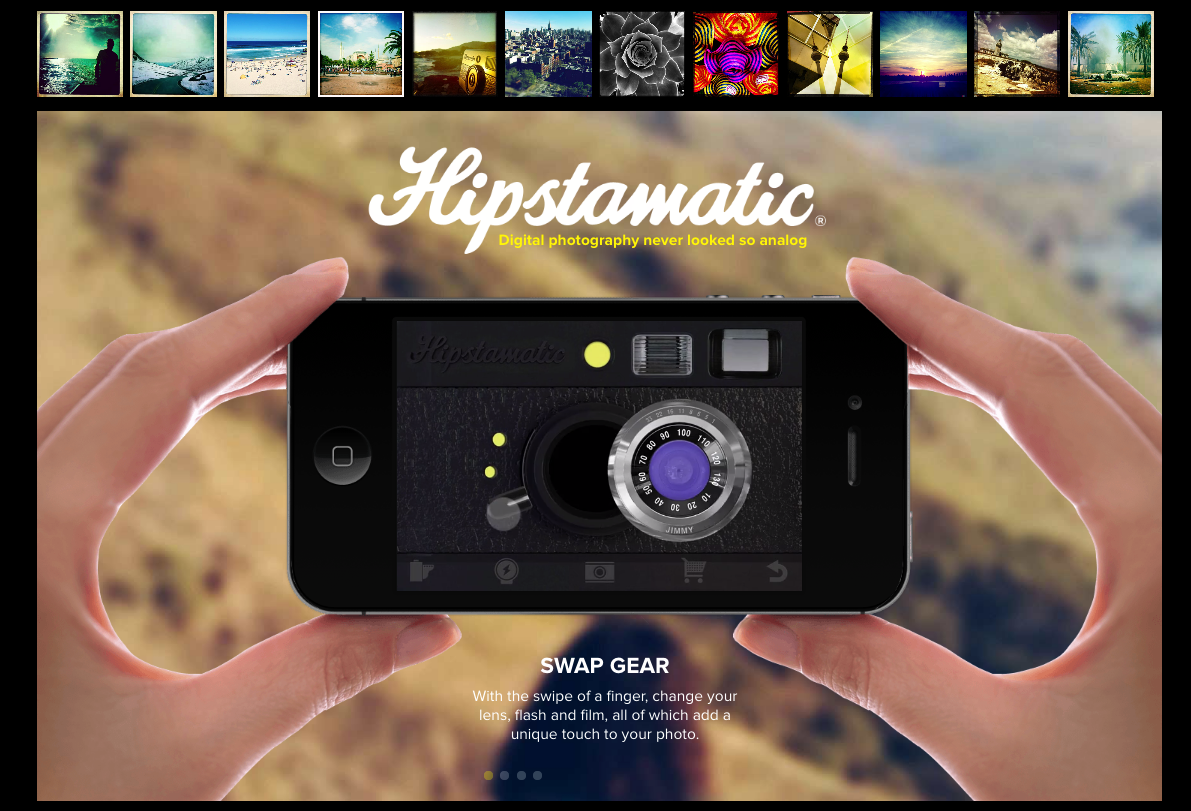
Example: Hipstamatic
Hipstamatic is a fantastic example of this. The folks behind Hipstamatic know that the types of people who want to use their photo-editing app are an artsy, younger market with an appreciation for the sort of ‘retro’ vibe that Hipstamatic images exude. Their landing page captures this with the page layout and the types of images they chose to showcase.
7. Display prominent links to social media and app store downloads.
While most people will scroll through a page before leaving it, it doesn’t mean they’ll see everything. Keep your most prominent pieces ‘above the fold,’ and this includes a link to download your app and a link to share it on social media (we recommend Facebook and Twitter, at the very least).
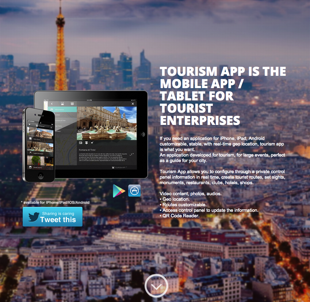
Example: Tourism app
Plenty of app landing pages remember to put social share features – but bonus points for the designers of the Tourism app for remembering the top-of-the-page rule.
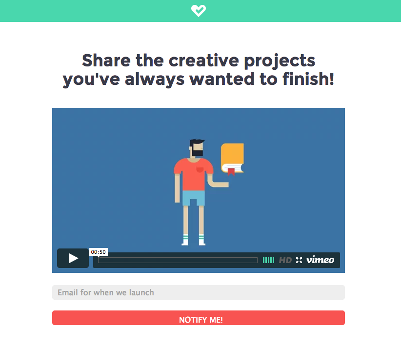
8. Harness the power of video.
Online videos are becoming increasingly more powerful marketing tools. By 2017, Cisco predicts videos will account for 69% of all consumer internet traffic – so you’ll be better off writing a script to explain your app than a block of text.
Example: Fostr
Fostr’s app landing page is a great example of this for a couple of reasons. Firstly, their video is short and sweet – which means more people will watch it all the way through. Secondly, the animations aren’t terribly advanced, yet the video is still extremely effective, which shows how simple this process can actually be.